Fall 2025
For the 57th issue of The Experience Magazine, I developed the visual direction for its promotional campaign, translating the established mid-century TV guide-inspired concept across social media graphics, posters, printed handouts, and a promotional zine. The campaign drew from vintage typography, retro color palettes, and editorial design conventions while evolving alongside the next issue’s developing aesthetic.
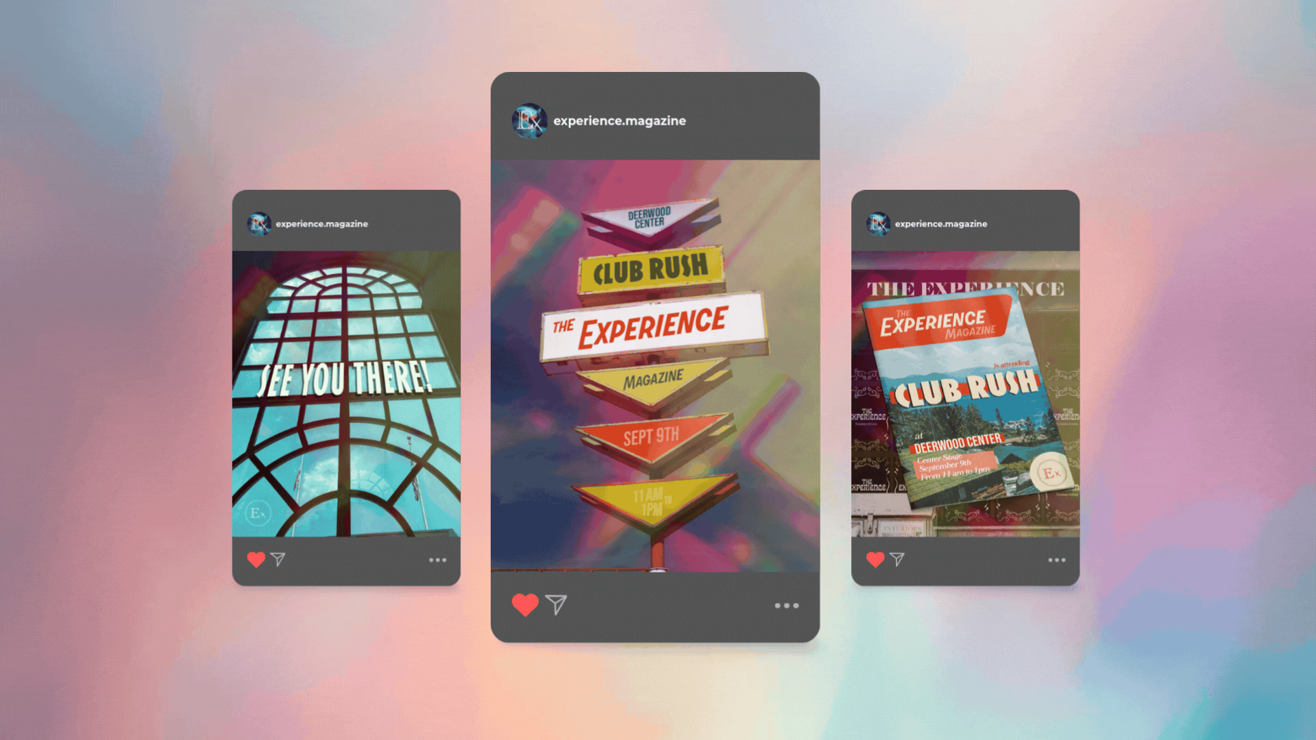
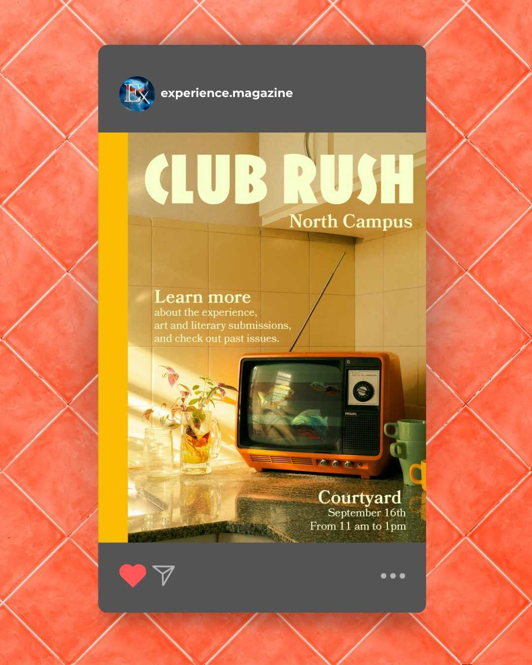
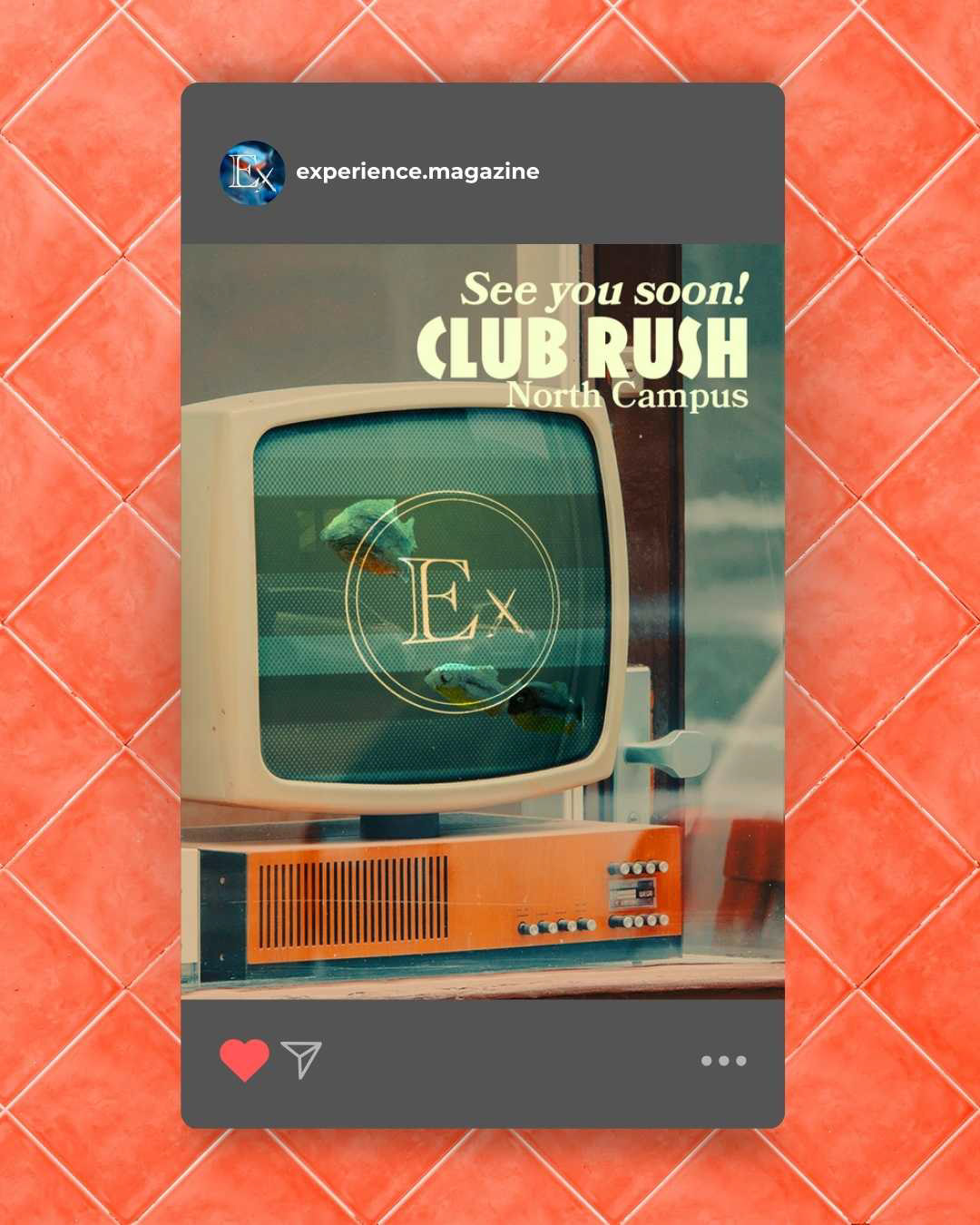
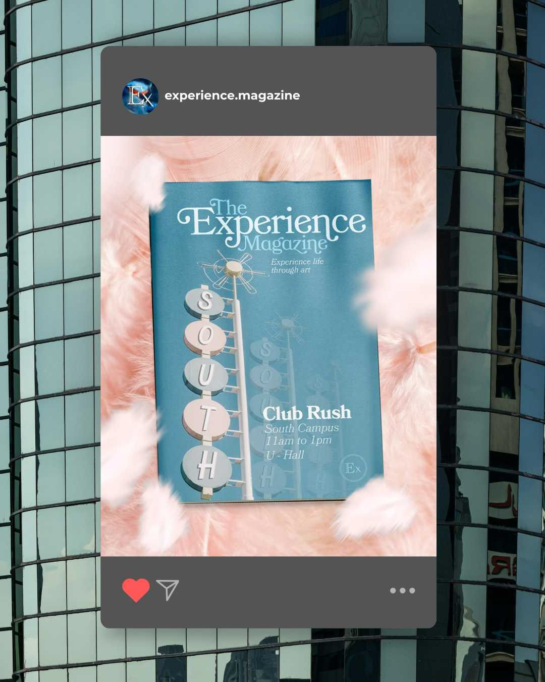
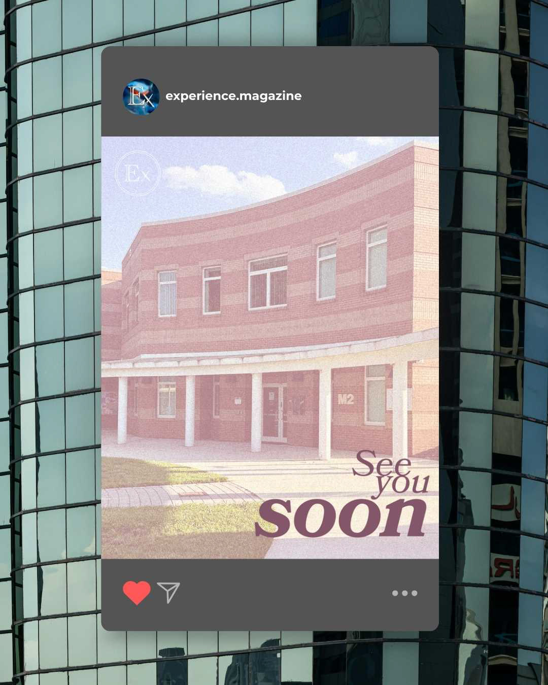
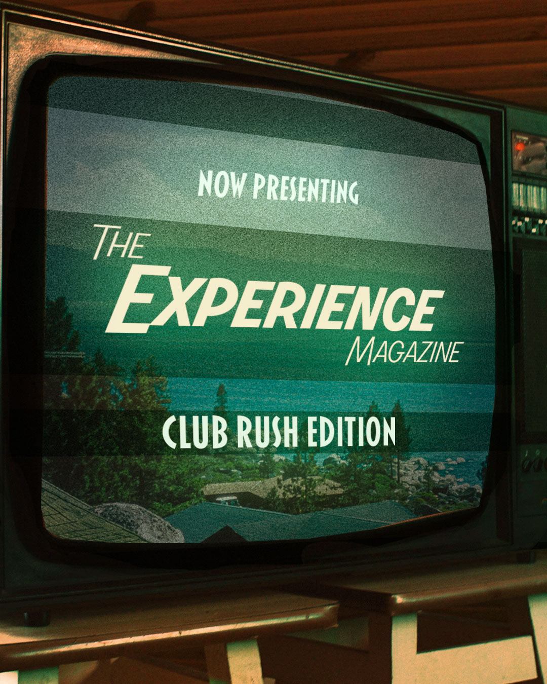
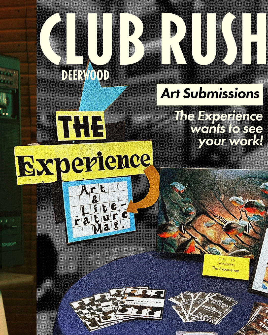
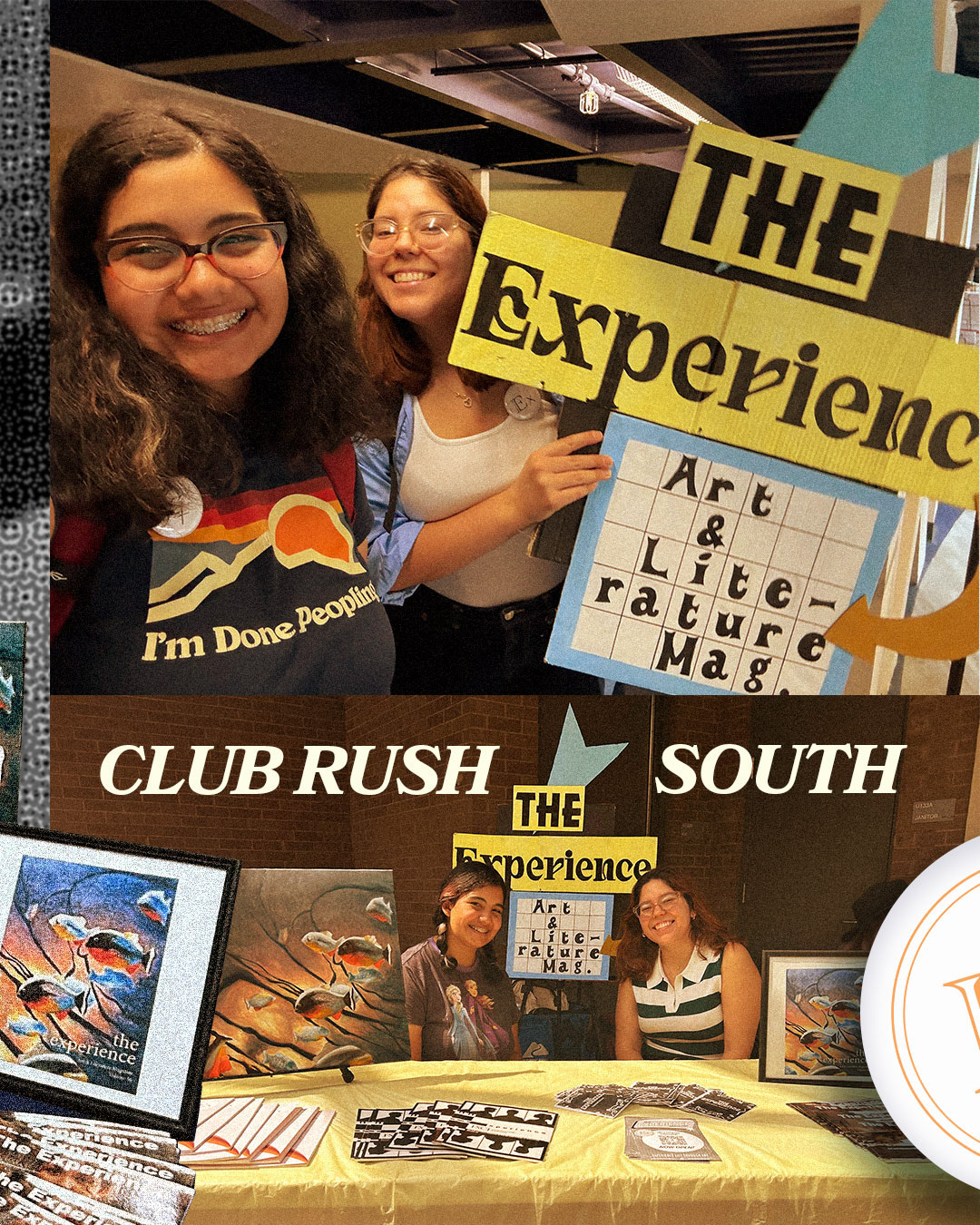
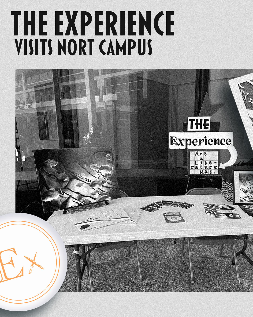
Club Rush - Social Media Campaign
Club Rush is a college-wide event hosted across multiple campuses, where student organizations present themselves and recruit members. The objective was to promote the magazine’s presence and ensure visual distinction within a highly saturated event environment.
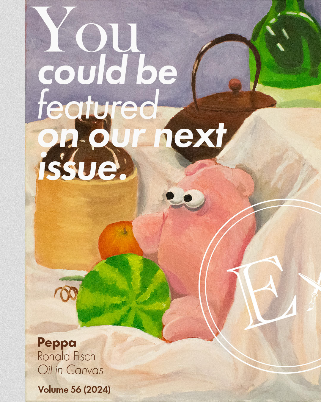
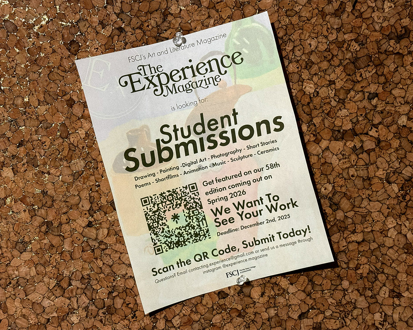
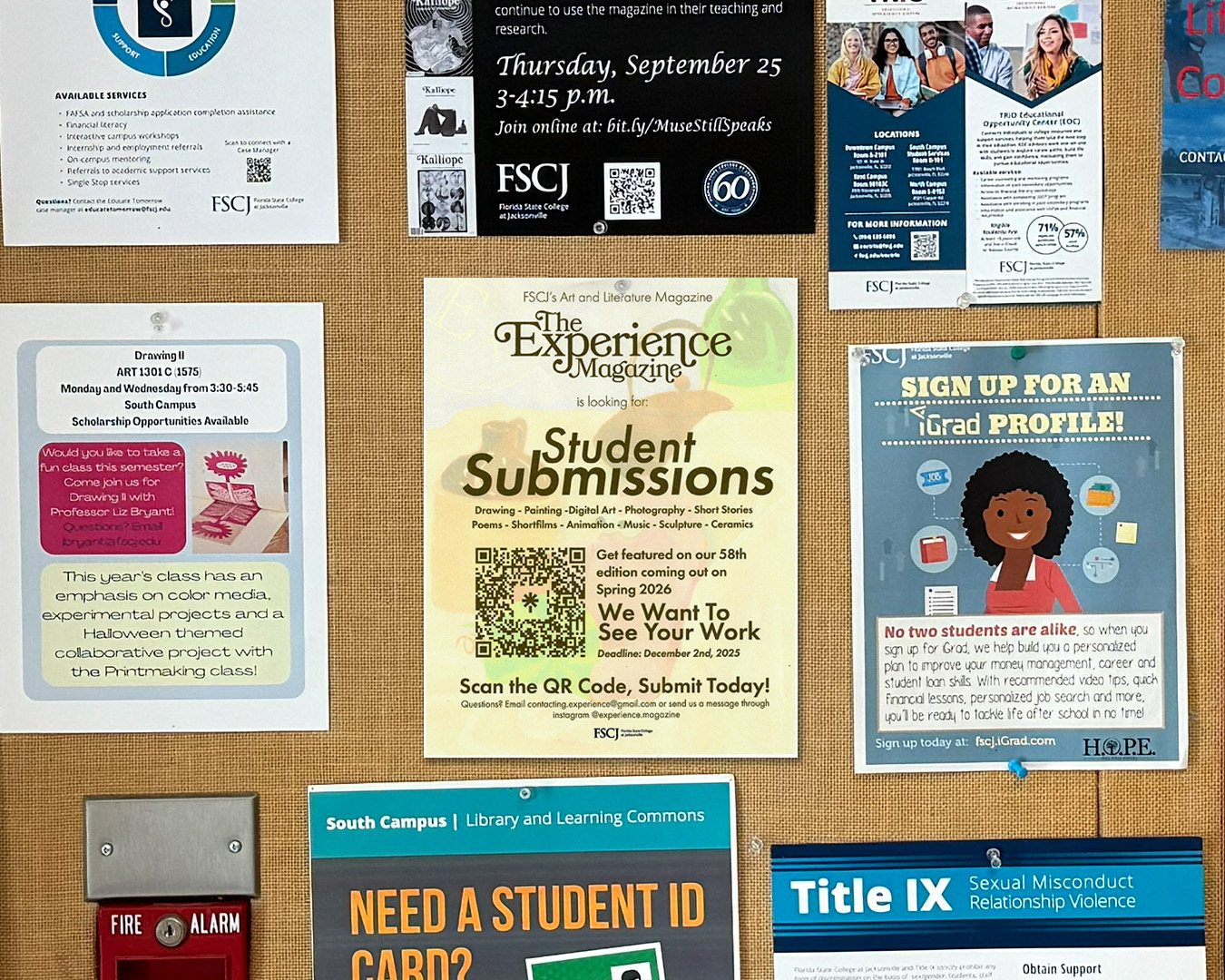
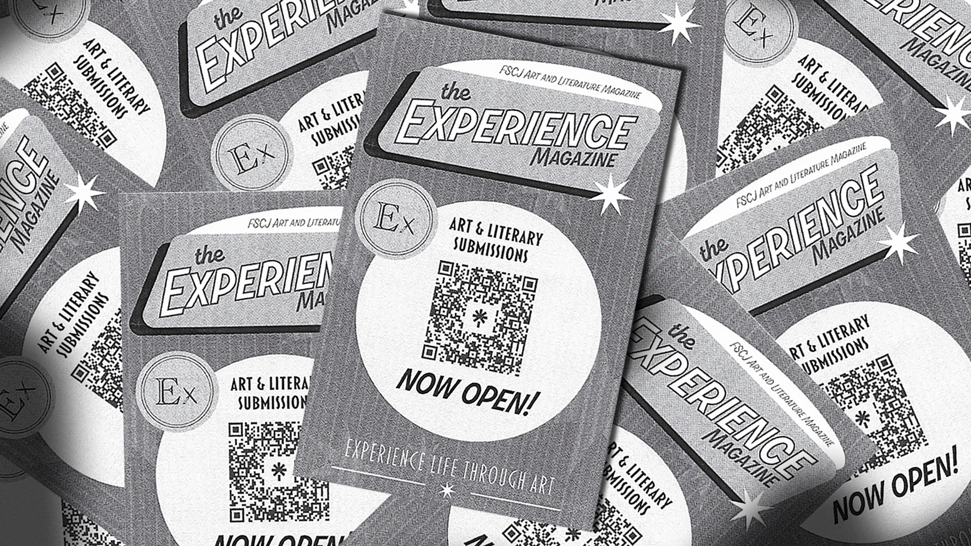
Student Submissions - Poster & Handout
I designed posters and handouts to promote student submissions, adapting the mid-century TV guide-inspired aesthetic into bold, high-visibility layouts for campus events and classroom outreach. While the posters served as long-term visual anchors in libraries and student centers, the black-and-white handouts were optimized for high-volume, low-cost distribution without losing the campaign’s vintage character.
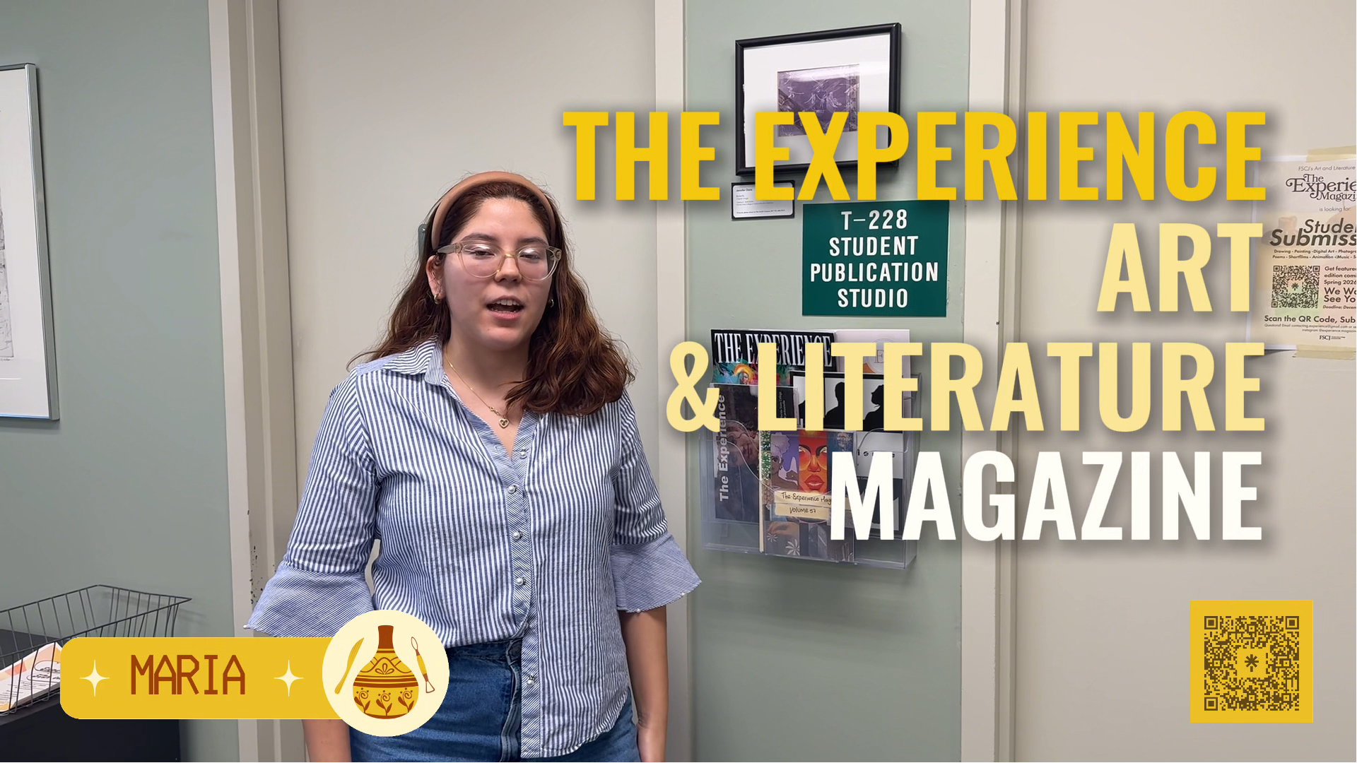
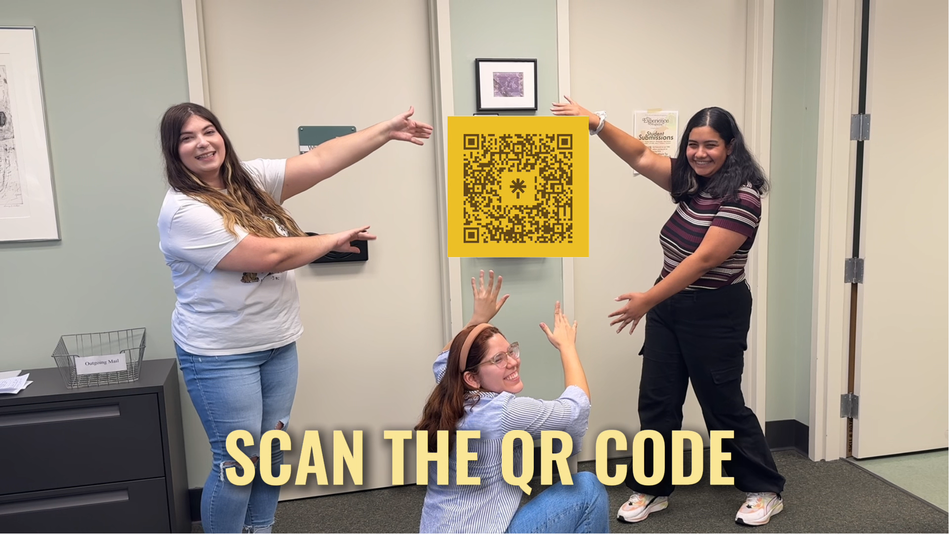
Get The Experience! - Promotional Video
Promotional recruitment video created for the magazine’s submission campaign, combining animated typography, motion graphics, and comedic pacing to introduce the publication and encourage student participation. Distributed through university communication channels and the school’s social media platforms.
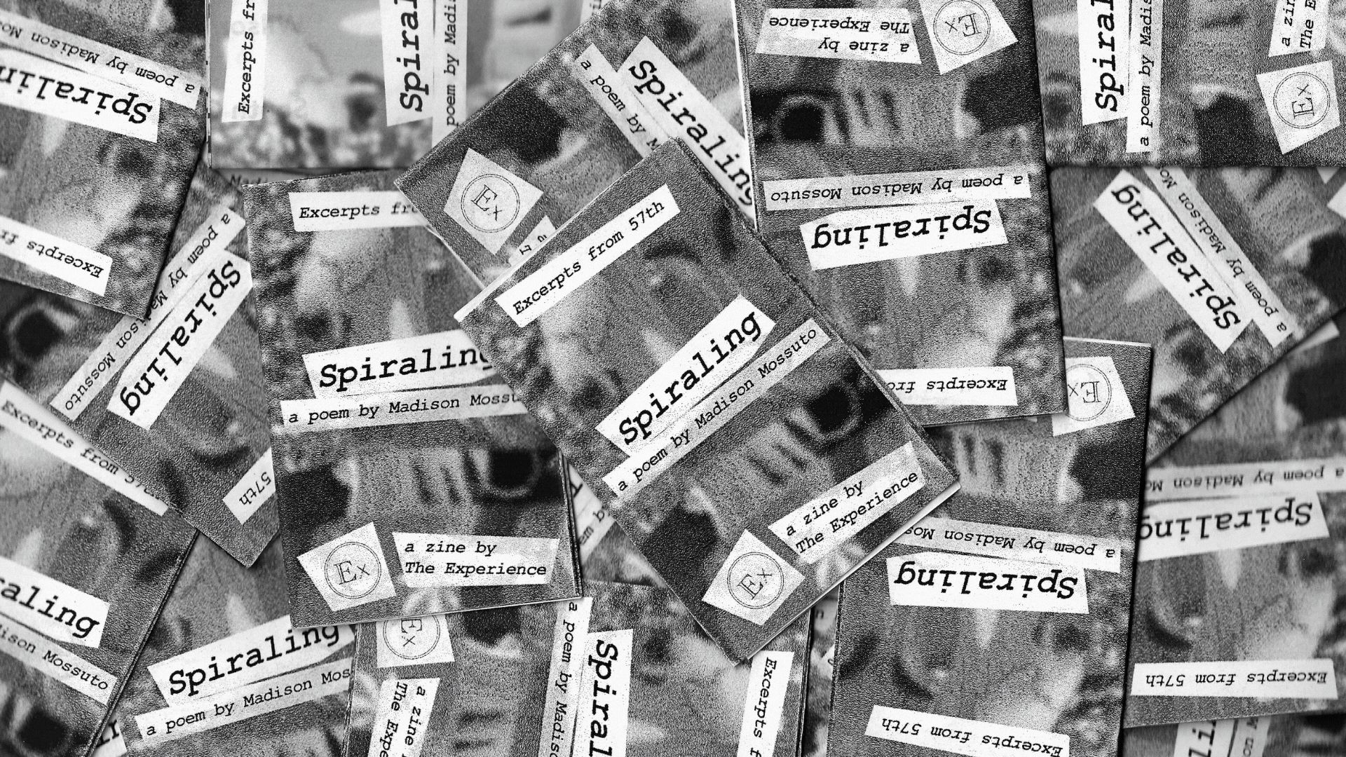
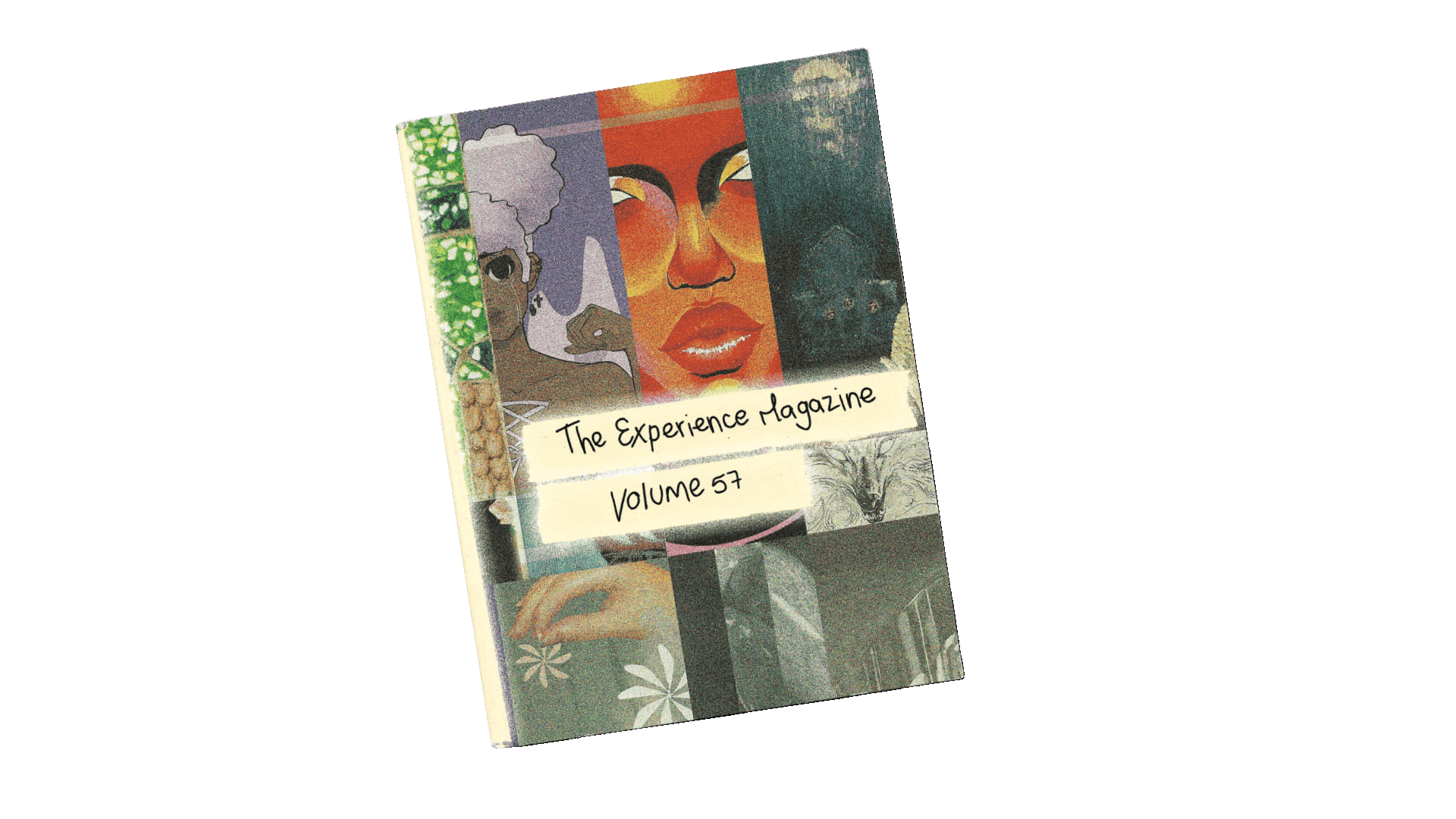
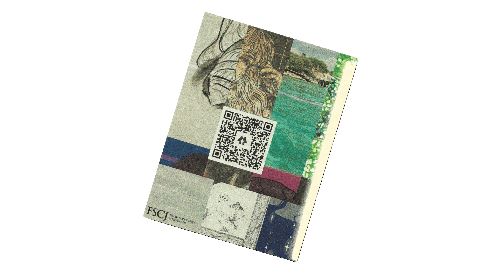
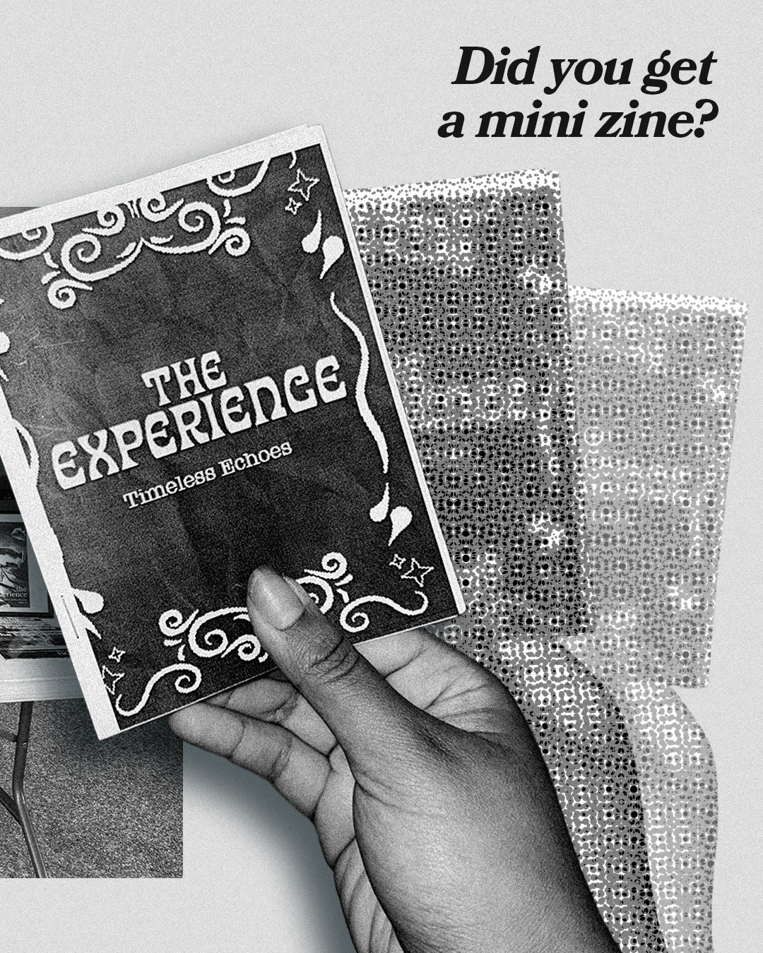
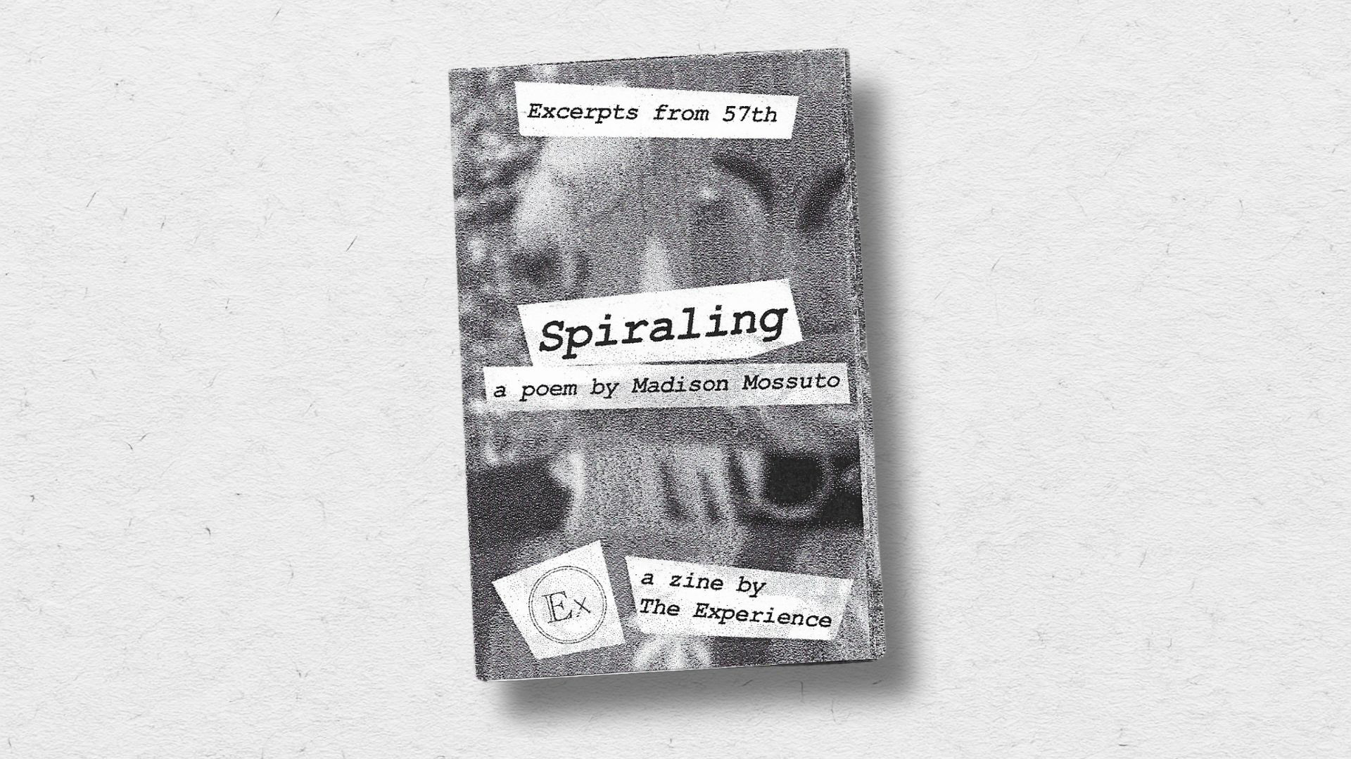
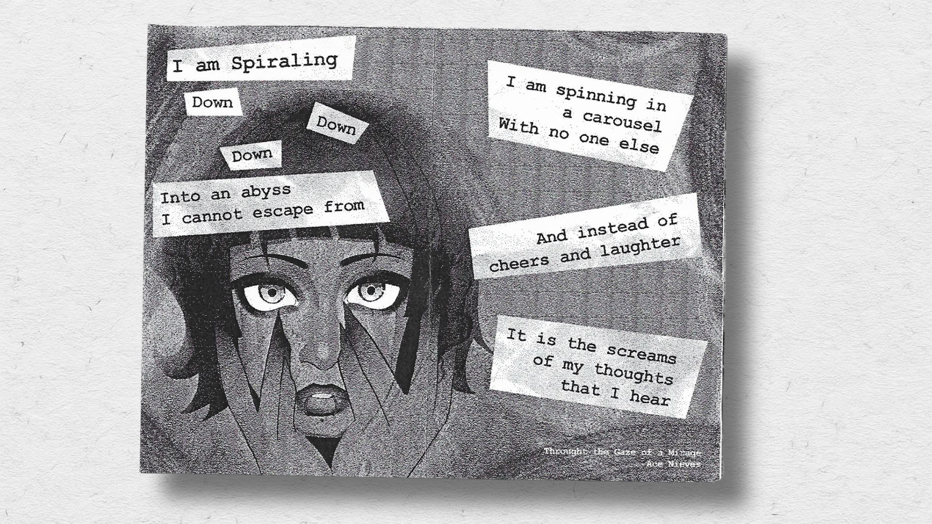
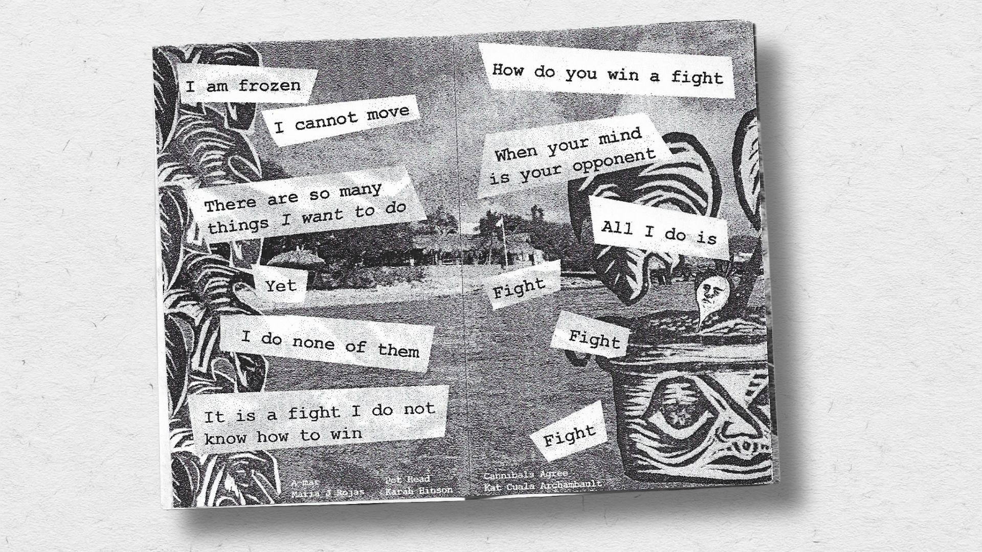
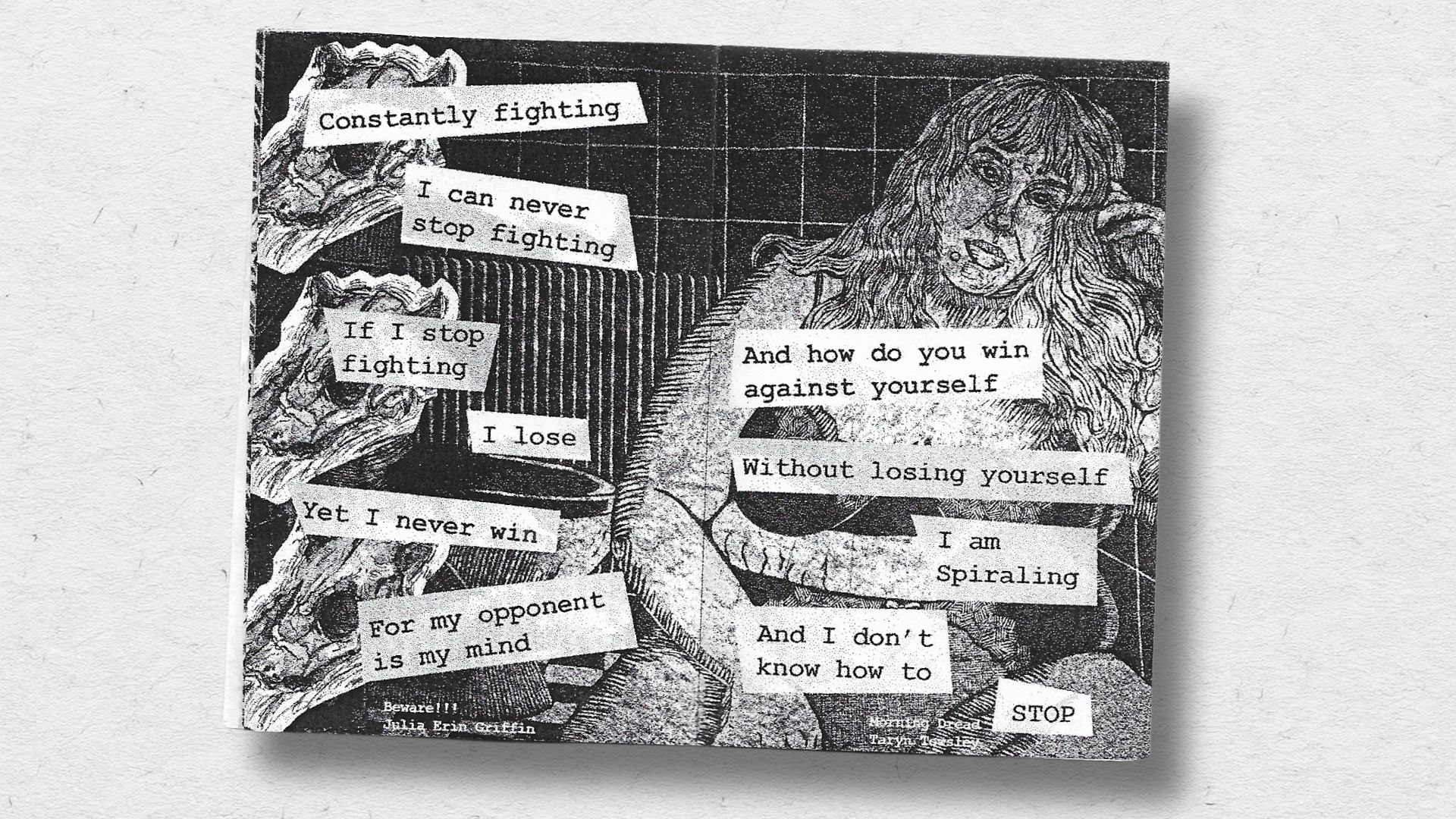
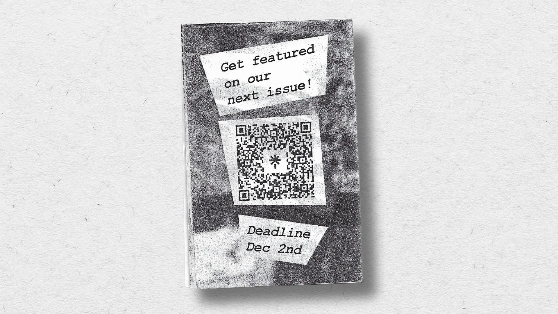
Spiraling - Promotional Zine
To encourage student submissions, I designed a black-and-white promotional zine featuring a poem and selected artwork from the latest issue. While the campaign was inspired by mid-century editorial design, the zine introduced a darker, more handmade aesthetic that hinted at the magazine’s shift toward a gothic fairytale style. Halftone textures, high contrast printing, and collage-inspired layouts gave the piece a raw, tactile feel while keeping production low cost and accessible.

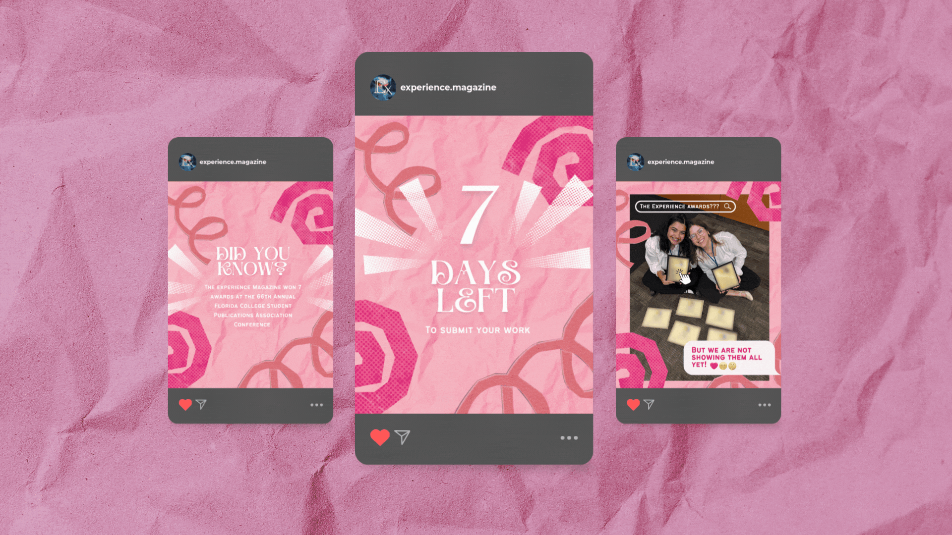
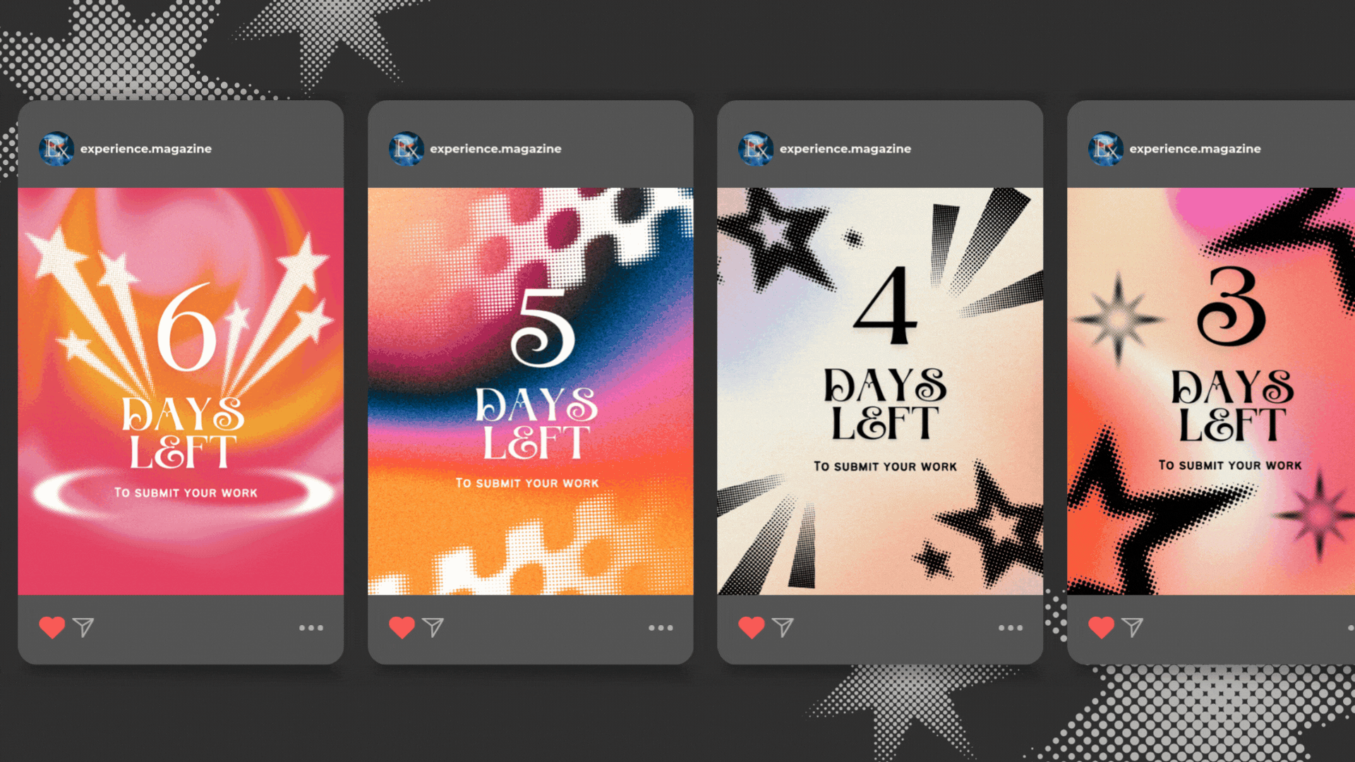
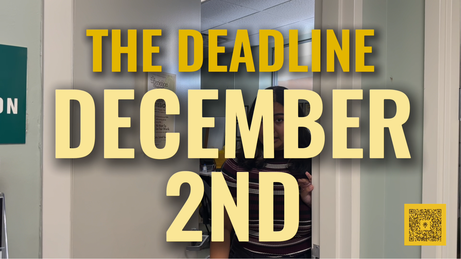
The Countdown - Social Media Campaign
To encourage final submissions, I designed a series of countdown posts leading up to the deadline. The posts marked a shift from the campaign’s earlier warm tones and black-and-white palette, introducing bold colors, gradients, and DIY-inspired textures. Some graphics paired deadline reminders with fun facts about the magazine, balancing playful visuals with clear messaging to create urgency while keeping the campaign’s student-focused tone.