Original Logo
Updating the Color Palette
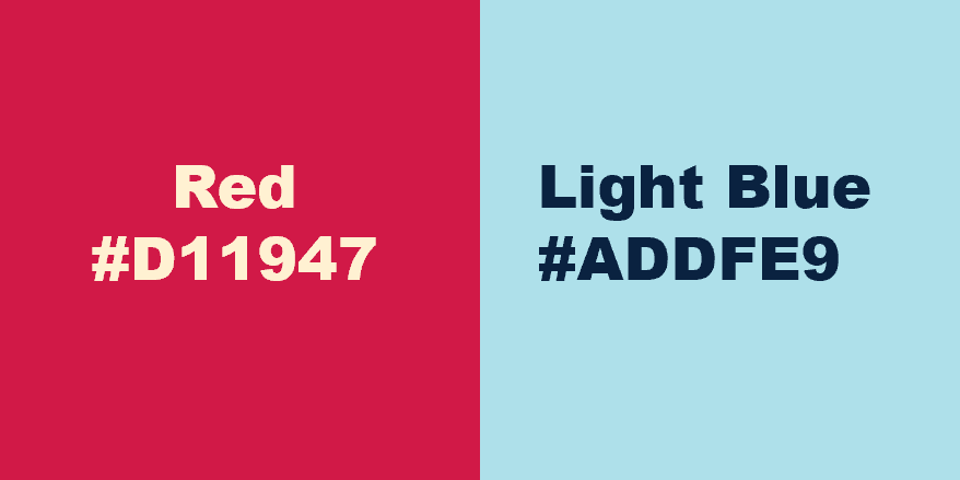
To modernize the brand, I developed a color palette that builds on the original red, white, and blue while incorporating warmer tones such as yellow, orange, and cream. The updated palette creates a more welcoming and approachable identity for college and university students while reducing the visual rigidity often associated with institutional brands.

Rebrand Logo Sketches
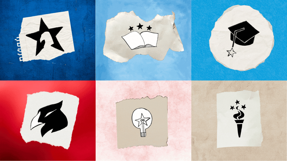
These early sketches explored a range of concepts inspired by American imagery and educational themes, testing different levels of abstraction to create a recognizable, adaptable, and approachable brand identity.

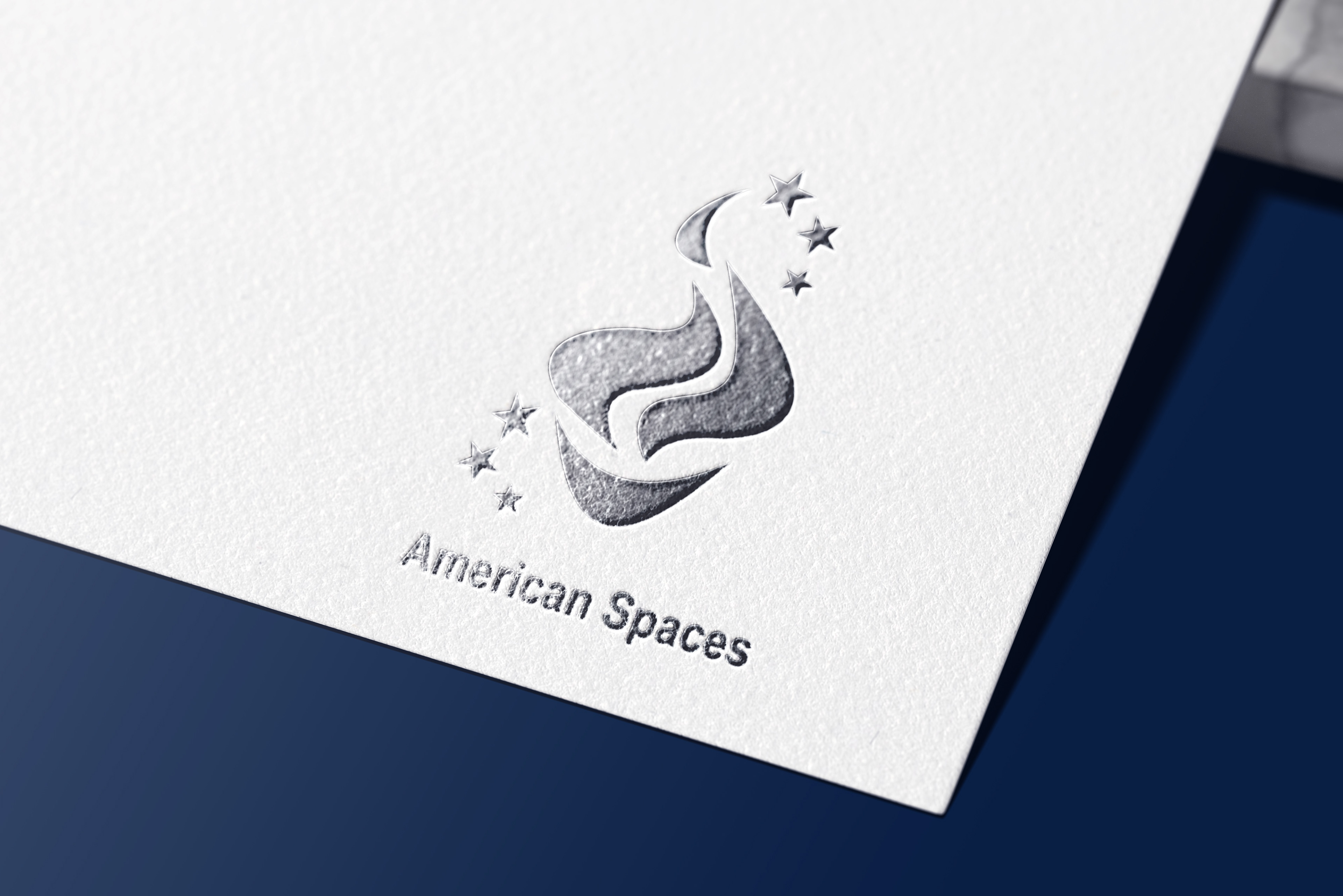
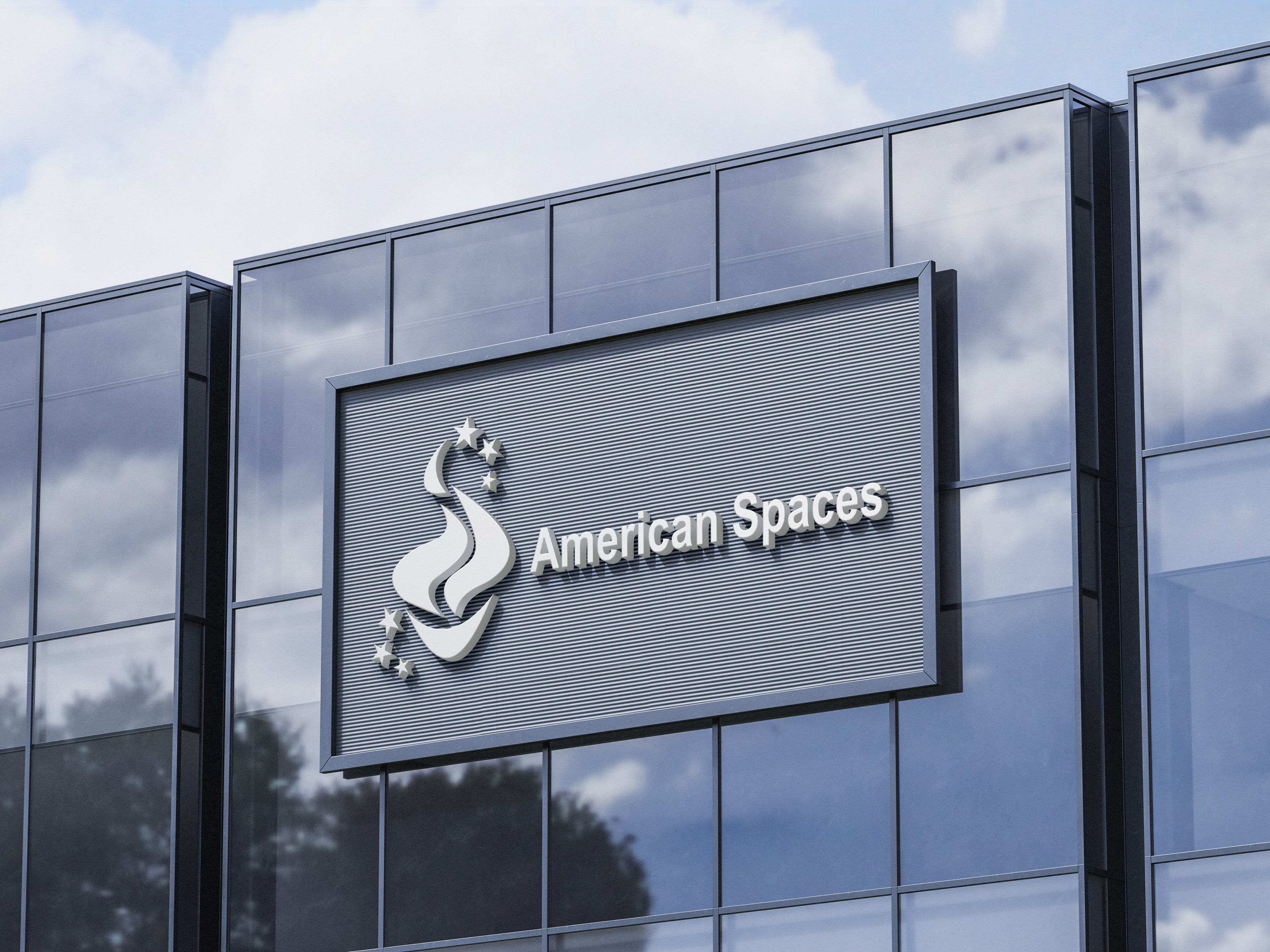
Inspired by the Statue of Liberty, the torch-and-stars concept symbolizes opportunity, connection, and the exchange of ideas between the United States and the communities served by American Spaces. Through several rounds of refinement, the torch’s elongated base was redesigned into a rounded form to create a stronger and more balanced silhouette. The final mark also incorporates six stars, representing the organization’s six core pillars.
Final Logo

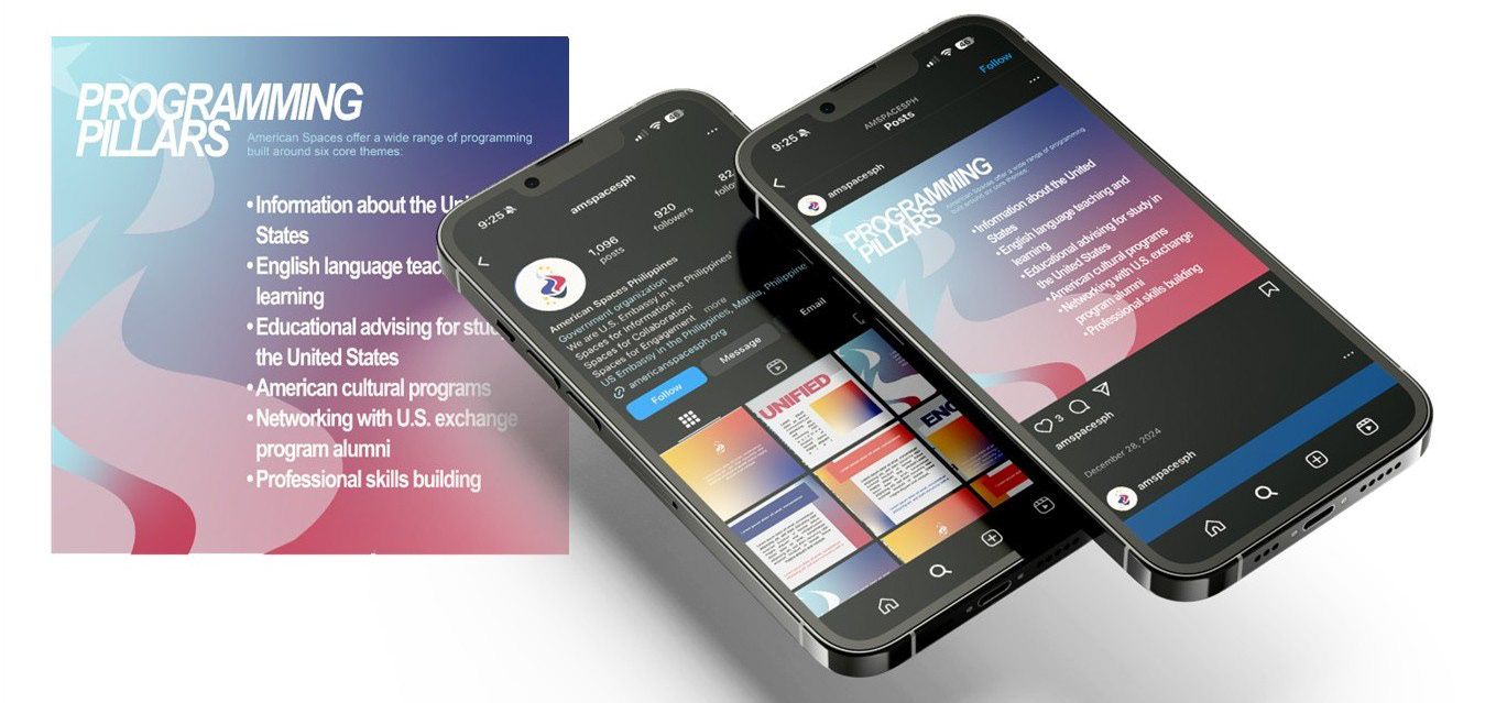
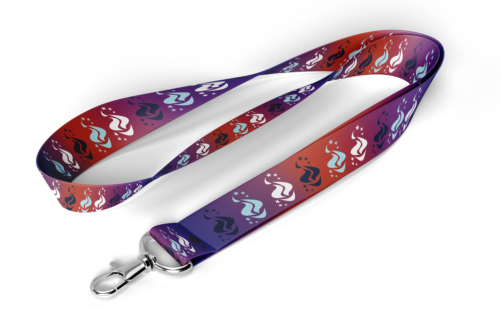
Brand Applications
To explore the brand’s digital and physical applications, I designed sample social media graphics along with various mockups of branded materials, including pins, lanyards, and pens, to demonstrate how the updated identity could extend across both online platforms and on-site touchpoints.